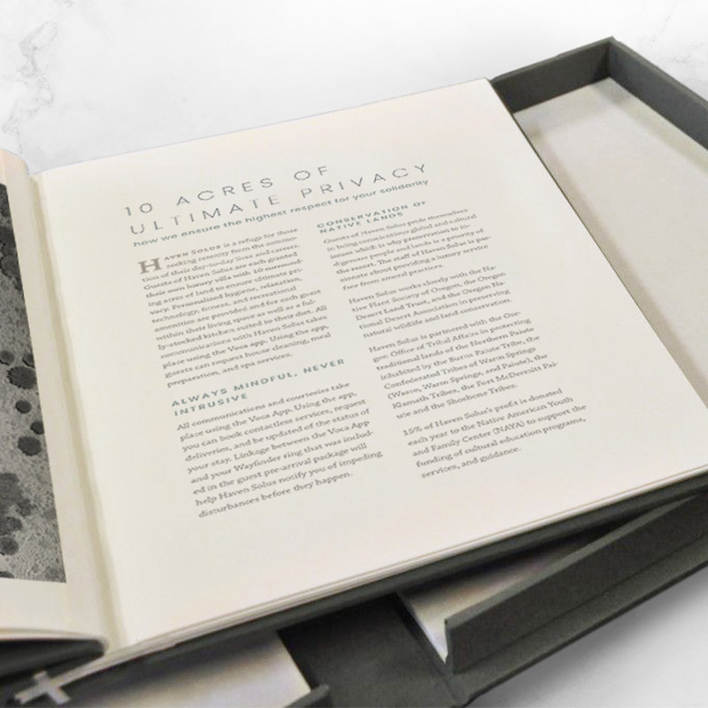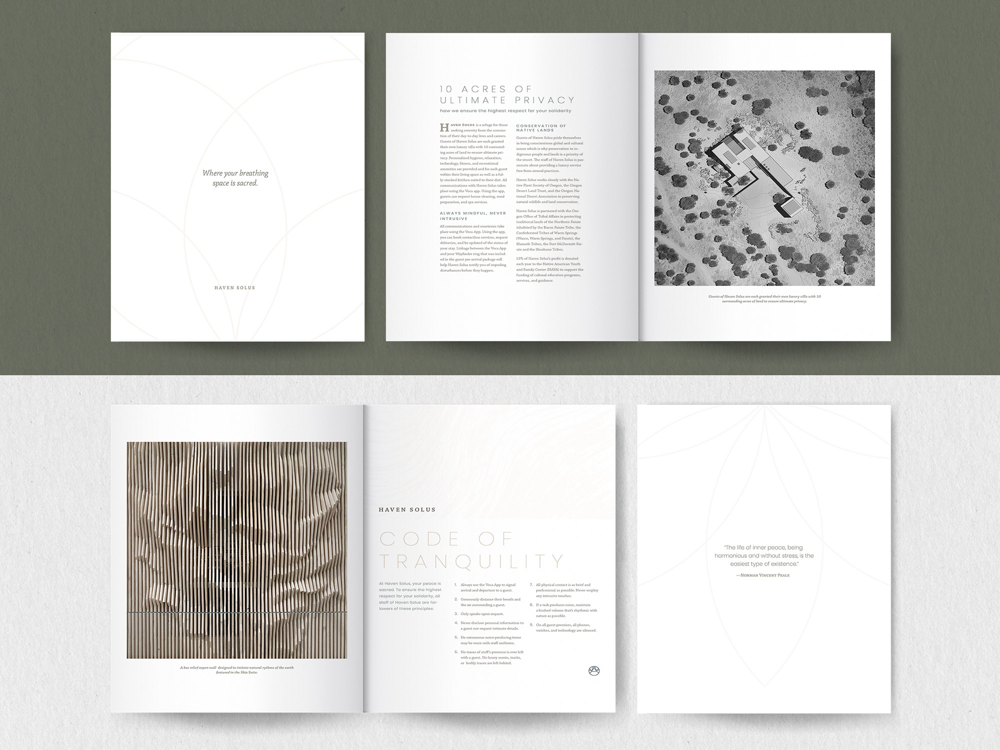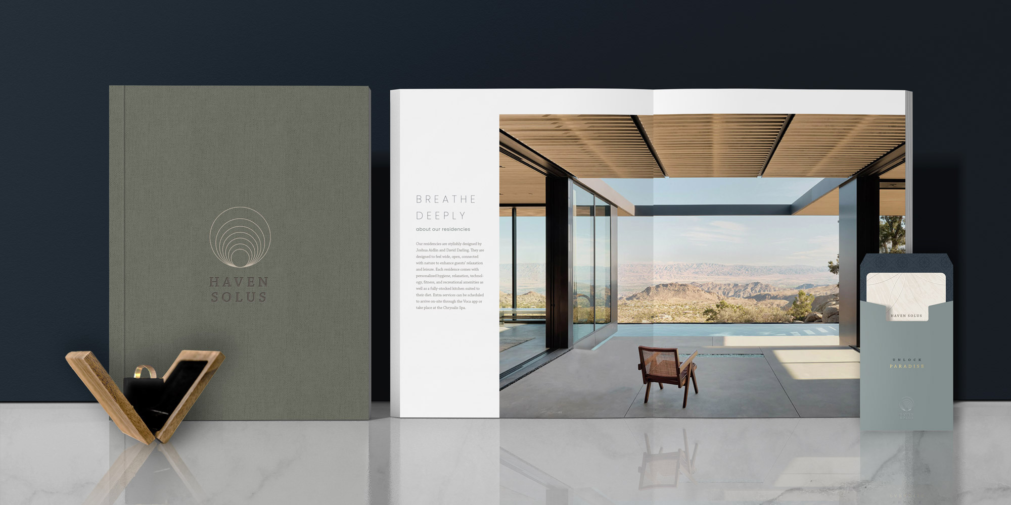
Haven Solus is a refuge for those seeking serenity from the commotion of their day-to-day lives and careers. Guests of Haven Solus are each granted their own luxury villa with 10 surrounding acres of land to ensure ultimate privacy. Personalized hygiene, relaxation, technology, fitness, and recreational amenities are provided and for each guest within their living space as well as a fully-stocked kitchen suited to their diet. All communications with Haven Solus takes place using the Voca app. Using the app, guests can request house cleaning, meal preparation, and spa sevices.
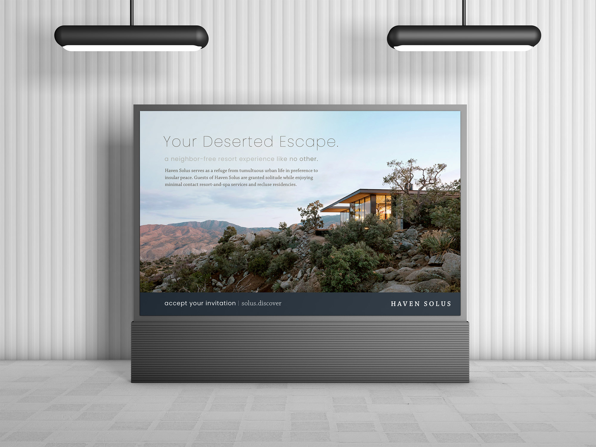
Haven Solus serves as a refuge from tumultuous urban life in preference to insular peace. Guests of Haven Solus are granted solitude while enjoying minimal contact resort-and-spa services and recluse residencies.
Tranquil, courteous, inviting, poised, soothing, elegant, carefree
Haven Solus serves the natural loners of the world, the those that relish in their singularity, those whose tranquility prospers when left alone, and those who are liberated by secession.
Guests are typically high-income, ages 35-65, white collar, from densely populated areas, and with few dependents.
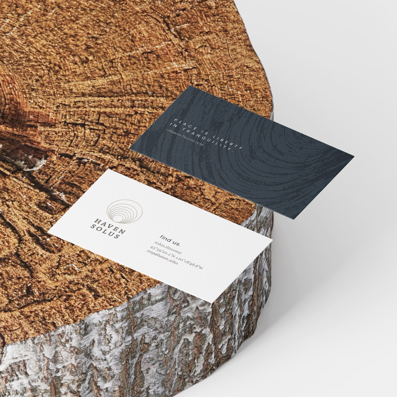
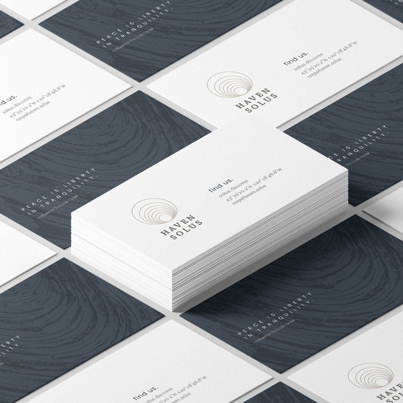
“Peace is liberty in tranquility.” —Marcus Tullius Cicer
“The life of inner peace, being harmonious and without stress, is the easiest type of existence.” —Norman Vincent Peale
“O solitude! if I must with thee dwell, Let it not be among the jumbled heap Of murky buildings …” —John Keats
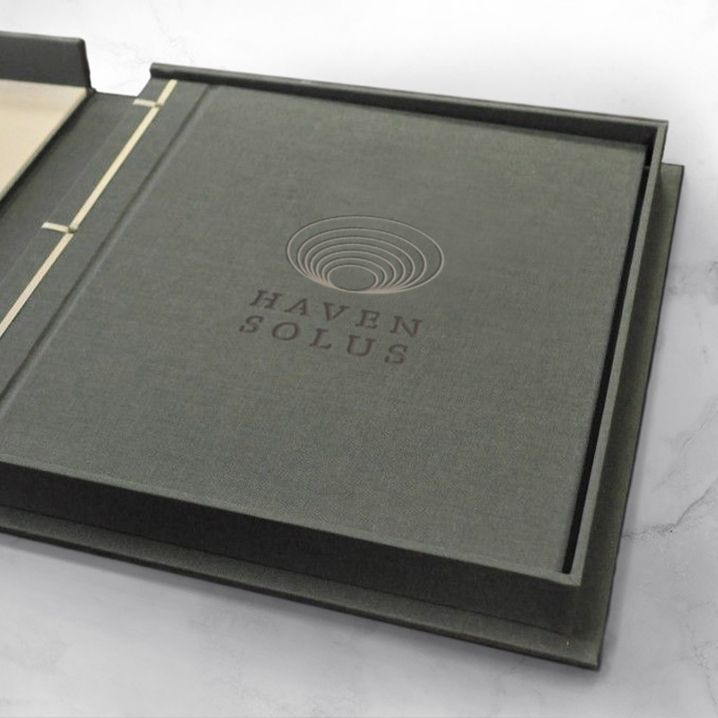
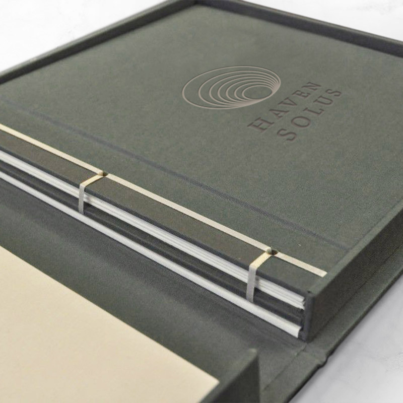
The logo was inspired by a seashell. Since shells aren’t a shared home, it is a symbol of singleness and protection. The shell is formed by cascading circles which represents self-alignment and peace.
Poppins is a geometric sans-serif used for headings. It was selected because its’ variety of light to hairline weights. When tracked out in all-caps, Poppins gives the impression of sophistication and openess.
Chaparral is a serifed font used in the logo and for body text. The subtle serifs are inobtrusive, polite, and mildly genial. It’s diverse family of weights lends to easy usage for body text, captions, drop caps, and more. It is especially charming in semibold small capitals with slight tracking, and in italics.
The Haven Solus color pallete is meant to illicit the sensations of walking through nature like the sound of moving water, the touch of cool stones or warm sand, the earthy smell of foliage, and the sight of flowers dancing in the wind. An array of tints and shades can be used for subtle touches of color or needed contrast.
These additional brand graphics are used within the system to identify different parts of the resort. A symbol can be used to indicate a message from the resort staff, it’s mobile app, the spa, or its social and conservation efforts.