Featured Project:
“This is Love” Triology
Book Covers Design
Stories of snails, ugliness, and cannabilism.
Stories of snails, ugliness, and cannabilism.

This project is a Pele Gold Award Winner & an AAF National Silver Award Winner.
The first book I designed, One in a Million , was the basis for my two other book cover designs to keep the trilogy cohesive. After exploring different mediums, production techniques, and layouts, I decided to use a combination of typography and photography for my book covers. The photo on the cover is small while the title is very large. The contrast in size is meant to pique interest and also give the book title the opportunity to speak for the story with its own unique type consideration and treatment. Each book cover has a different color to let the mood of the story shine through.

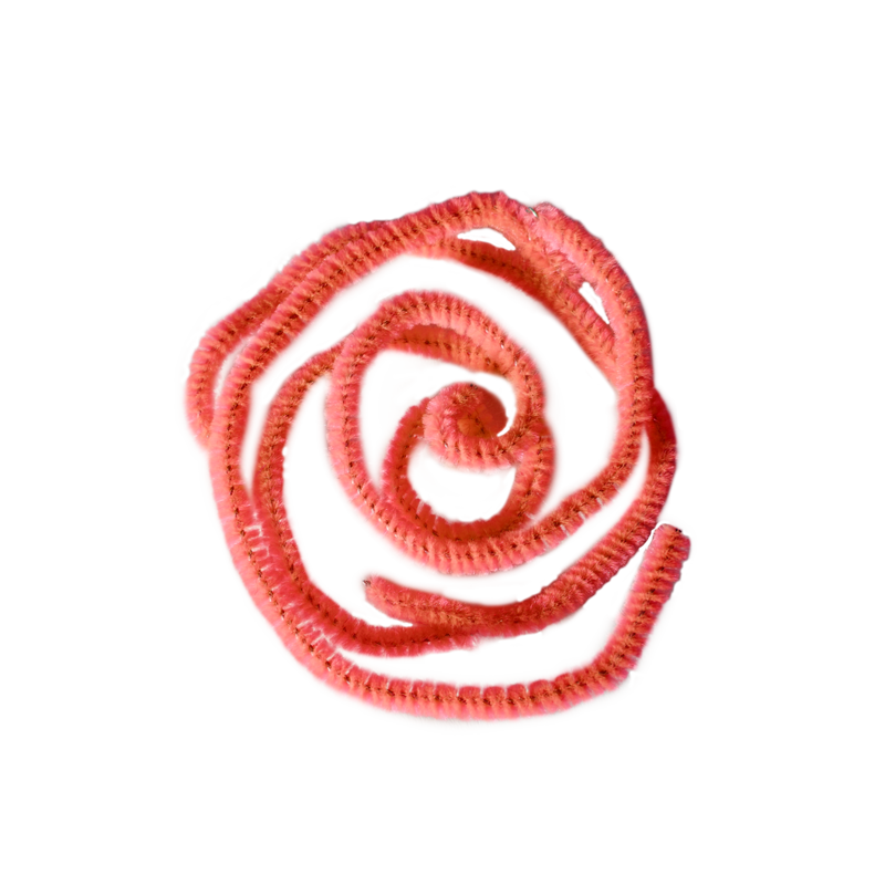
The spiral on One in a Million represents the moment two snails meet—a detail about the story readers would recognize after completing the book. The resemblance to a rose is a gesture towards romance. The typeface Helvetica Neue and light blue color is meant to feel optimistic.
Listen to "One in A Million"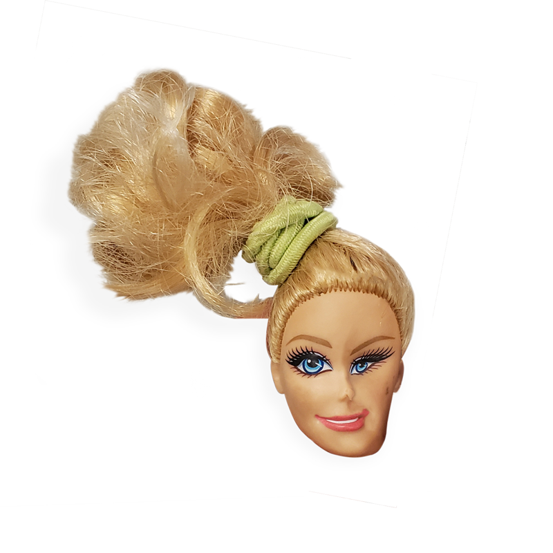
My goal with The Ugly Club was to express peculiarity. I did this with a manipulated doll photo, a mustardy green color, and the typeface Superclarendon. The two-story 'g' of Super Clarendon was the particularly strange factor that led me to choose that typeface.
Listen to "The Ugly Club"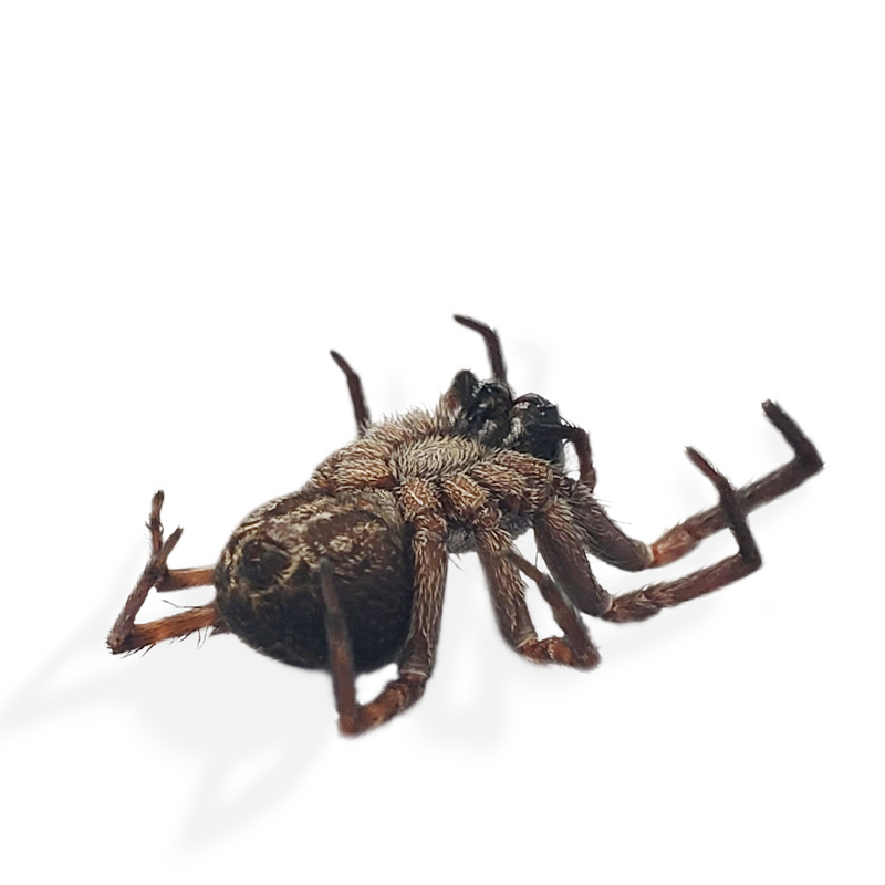
This is Love features a photo of a dead spider, hot pink, and the typeface Tenez. My intent was to communicate the drama of sacrifice for the sake of love. I chose hot pink because it felt maternal yet drastic and the typeface Tenez because the bracketed serifs resembled spider legs.
Listen to "This is Love"